Monday, June 20, 2011

Final Project


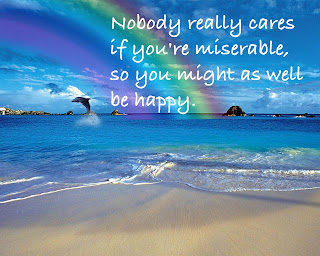
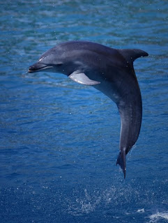
For my final project, I created my image with a tutorial from my previous blogpost.  It is just a simple photo of a beach with a rainbow.  However, I did add one photo to make my art more attractive.  I used a photo of a dolphin, jumping out of the water.  I added this, and it made my art pop.  Next, I used a quote that I found on on the internet and it is, "Nobody really cares if you're miserable, so you might as well be happy."  This sends a clear message to everyone.  Last, I made it 10 by 8 photoshop document at 200 dpi.  Adding the quote made my image graphic design, as it motivates, is an opinion, and sends a clear message to everyone.

Friday, June 17, 2011

"Rainbow In Photoshop" Tutorial

For my final 50 points of the needed 200 points in the fourth quarter, I decided to do a simple tutorial on how to create a rainbow in photoshop.  This was an easy ten step tutorial, yet portrays a very well designed scene.

For the first part of my project, I used an image of a sandy beach as the background for the Rainbow.  This was a very simple, yet effective picture.


For the second and final part of my project, I added a radial gradient with rainbow colors.  I switched the opacity level to 45%, and there you have it.  A rainbow in Photoshop.

Wednesday, June 15, 2011

Alphabet Name Project

For my second project, I used Photoshop and assembled my name while using text tutorials.  I simply used a different tutorial for every letter in my name.  The website I used for the various tutorials was:  http://www.photoshopessentials.com/photoshop-text/text-effects/.  I placed each letter in a different photoshop file, then when I was done, I brought all the letters on to one document.   

Fire Text Project

For my first project, I used Photoshop to create a Fire Text image.  The tutorial I followed to make this image was:  http://psd.tutsplus.com/tutorials/text-effects-tutorials/dramatic-text-on-fire-effect-in-photoshop/.  I really like the way this image came out.  It is a very unique design that took some hard work.  What I like best about this photo is the way it attracts the eye through the orangish color.
  

Friday, May 13, 2011

Fantasy Poster

My project is an Fantasy Poster created in Adobe Photoshop.  I used Lebron James as a focal point in my image.  The first step in my project was to find Lebron dunking a basketball to create a dramatic effect.


The second step in my project was to find an image that portrayed a fantasy-like scene.  So, I used an image of clouds.


Next, I erased the background in the photo of Lebron dunking the basketball.  I placed the clouds over the original photo of Lebron James, then placed Lebron over the clouds.  This gave the scene a Fantasy feel, and created an attractive poster.


Finally, I made some final touches by adding text to the poster.  I searched for a tutorial on how to make text pop.  I was able to find one that included ideas for using inner/outer glow, as well as contour, texture, and stroke.  This tutorial added the finishing touches to my fantasy poster.   

Sunday, April 17, 2011

Art Deco Photoshop Project 1


In this project, I used Adobe Photoshop to create a fantasy golf scene.  I tried to stress the idea that golf in Florida can be luxurious and fun.  In this particular project, it could either be a fantasy, or reality.

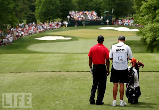
To begin with, I used a combination of different photos to create my scene.  I used the 17th Hole at TPC Sawgrass, one of the most iconic holes in all of golf.


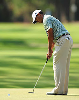
Next, I used a photo of Tiger Woods, on the putting green.


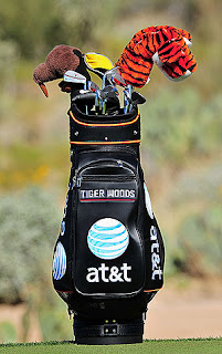
Also, I used a picture of Tiger Woods' golf bag.


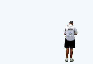
                              I then used an image of Tiger Woods' caddy, Stevie Williams.  I used a Photoshop tool to erase the area behind Williams.  Because I had trouble finding the eraser tool, I used a tutorial in helping me do so.


BEFORE


AFTER

http://www.muymono.com/tutorials/photoshop/erase-background-photoshop/ helped me in removing the space surrounding Stevie.


The last photo I used was a golf ball that Tiger Woods would be putting with.


Finally, I brought the existing images together, and displayed a scene that people can only dream of.  Tiger Woods, on the most iconic hole in golf, is as good as it gets.  I used the type tool to simply write "FLORIDA".  I applied the filter option in Photoshop to make the image look different.  This project attracts the eye to visiting this surreal place on your next getaway.

Thursday, February 17, 2011

Logo Advice

Initial Logo:  For this logo, I used a blue box as my background to help make the letters pop.  I used the "Myriad Pro" font to soften the letters.  Also, with the help of Pathfinder, I added the text and grouped it.  I like this design because it is simple, but effective.  What do you think?


Name Logo:  For the name logo, I used two rounded rectangles with a sky and navy blue color.  I also bolded the font, "Blackoak Std" to, again, make the text pop.  This logo is not very complex, however, I think it does the job.  What do you think?


Symbol Logo:  One of my favorite things to do is play golf.  I used a golf club and tee, with the dot in "J" as the golf ball.  This is definitely my favorite logo because it incorporates both golf and my name.  I used a simple "Times New Roman" font and grouped the letters together.  What do you think of this logo?